POLL: The New Club Crest
Moderators: Gnome, last.caress, Wilko1304, Rio, bristolhammerfc, the pink palermo, chalks
- Up the Junction
- Thinks he owns the place
- Posts: 71110
- Joined: Wed Dec 04, 2002 12:03 am
- Has liked: 764 likes
- Total likes: 3494 likes
POLL: The New Club Crest
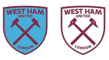
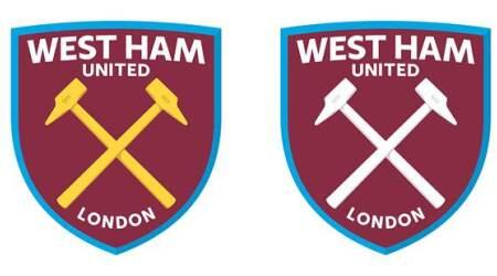
So here it is in both 3D and (various) 2D, as designed by Kensington's WTF Creative.
You've provided a mixed bag of opinions regarding the proposed new club crest since it was revealed last night and here is your opportunity to express those thoughts (unfortunately, there is no facility to do so via the YouGov poll).
Answer 'Yes', 'No', or 'Unsure'. Nice and simple
- Ludeksgloves
- Posts: 4057
- Joined: Fri Apr 26, 2013 8:28 pm
- Location: In Goal
- Has liked: 37 likes
- Total likes: 489 likes
Re: The new club crest poll
Cheap, tacky and very Lego Land. It looks like a fake badge from one of the many football manager games from the early 00's that didn't get the right to use the official badges. Terrible.
- wolf359
- Posts: 26962
- Joined: Sun May 11, 2003 6:22 pm
- Location: Wigan
- Has liked: 1591 likes
- Total likes: 1740 likes
Re: The new club crest poll
As many have said the basic design is ok, just get rid of the bling
Last edited by wolf359 on Thu Jul 10, 2014 1:41 pm, edited 1 time in total.
- Gormalysis
- Posts: 1936
- Joined: Tue Aug 31, 2010 1:08 pm
- Has liked: 29 likes
- Total likes: 50 likes
- Sloop John B
- The voice of reason
- Posts: 7484
- Joined: Thu Dec 05, 2002 1:02 pm
- Location: On the High Seas
- Has liked: 242 likes
- Total likes: 477 likes
Re: The new club crest poll
I went with Unsure.
Like the thought of the redesign with just the crossed hammers in principle but for some reason I just do not like that design.
Too bold and colourful.
Make it more slick
Like the thought of the redesign with just the crossed hammers in principle but for some reason I just do not like that design.
Too bold and colourful.
Make it more slick
- Knighter10WHU
- Posts: 4170
- Joined: Mon May 30, 2011 10:22 pm
- Location: Berkshire.
- Has liked: 153 likes
- Total likes: 194 likes
Re: The new club crest poll
Poor design, looks very 'Americanised'.
Don't like the fact the "United" is less important than "West Ham".
Also would rather see "East London" or "1895" as opposed to "London" on the badge.
And finally, I dislike the 2 tone colour idea, feels like Brady and the rest of her chums just want to turn us into the next Arsenal from top to bottom.
If it isn't an improvement on what we have already got, there is no point in changing it. Surely we can do better than this?
- Faubert's Boot
- Posts: 4380
- Joined: Sun Dec 21, 2008 5:24 pm
- Location: Benfleet, Essex
- Has liked: 1 like
- Total likes: 26 likes
- Up the Junction
- Thinks he owns the place
- Posts: 71110
- Joined: Wed Dec 04, 2002 12:03 am
- Has liked: 764 likes
- Total likes: 3494 likes
Re: POLL: The New Club Crest
My thoughts, having taken a while to digest it. My first impressions are positive, however...
1). I don't like 'United' being smaller than 'West Ham'; we are 'West Ham United'.
2). London (or east London) is okay, not 1895 (because WHUFC wasn't formed until 1900 whichever way you look at it). It looks better curved than it would straight. Yet the word should still be in a smaller font than the club's name.
3). I like the two tone background. Helps give the overall impression of a ship's hull.
4). Slightly concerned at the nominal use of blue. We are claret and blue.
5). The 'TIW' inscription on the Hammers is a nice touch.
6). I think there's an opportunity to try this with the club's name ABOVE the shield, not inside.
Re: The new club crest poll
A no from me.
I've worked in branding design for 10+ years and now own an agency specialising in it and I'd be appalled if my company produced this.
The font and placement is laughable and the detail itself is cheap and tacky.
Back to the drawing board.
I've worked in branding design for 10+ years and now own an agency specialising in it and I'd be appalled if my company produced this.
The font and placement is laughable and the detail itself is cheap and tacky.
Back to the drawing board.
- Up the Junction
- Thinks he owns the place
- Posts: 71110
- Joined: Wed Dec 04, 2002 12:03 am
- Has liked: 764 likes
- Total likes: 3494 likes
Re: The new club crest poll
Well let's see what you can do?Fry wrote:I've worked in branding design for 10+ years and now own an agency specialising in it and I'd be appalled if my company produced this.
Re: POLL: The New Club Crest
No.
Cheap and tacky. Looks poxy, makes us seem like a plastic franchise from the US.
- Aceface
- Posts: 16448
- Joined: Tue Nov 16, 2010 11:01 am
- Location: Blighty
- Has liked: 377 likes
- Total likes: 1472 likes
Re: The new club crest poll
This, in a nutshell.Sloop John B wrote:All the right elements but the design is very poor.
- giantsteps
- Posts: 5798
- Joined: Tue Jan 13, 2009 2:44 pm
Re: POLL: The New Club Crest
Someone please get me up to speed: what's the YouGov poll and why can't we vote on it?
Is this crest official now? I.e: we're stuck with it.
My thoughts:
Bring back the scroll underneath and keep the current (castle badge) font.
Change the "London" to "East London"
If these things were implemented I'd be half-way nearer to being happy with it.
Is this crest official now? I.e: we're stuck with it.
My thoughts:
Bring back the scroll underneath and keep the current (castle badge) font.
Change the "London" to "East London"
If these things were implemented I'd be half-way nearer to being happy with it.
Re: POLL: The New Club Crest
No, effing horrible.
If you call yourself West Ham, you'll get back to the drawing board...
What's right about it... goodbye castle.
What's wrong about it... everything else.
If you call yourself West Ham, you'll get back to the drawing board...
What's right about it... goodbye castle.
What's wrong about it... everything else.
- the pink palermo
- Huge noggin
- Posts: 45155
- Joined: Thu Sep 03, 2009 12:00 pm
- Location: The Notorious Gate B @LS
- Has liked: 813 likes
- Total likes: 3033 likes
Re: POLL: The New Club Crest
I appreciate a straight yes or no poll .
If only the club did .
No.The "Arsenalfication" of West Ham United has already gone too far .
If only the club did .
No.The "Arsenalfication" of West Ham United has already gone too far .
- Knighter10WHU
- Posts: 4170
- Joined: Mon May 30, 2011 10:22 pm
- Location: Berkshire.
- Has liked: 153 likes
- Total likes: 194 likes
Re: POLL: The New Club Crest
You can vote on the YouGov poll (on the official website), but cannot leave any comments. Which suggests to me that it is a done-deal and the club don't care what our thoughts are on it, they just wanted to send out a poll to say they have "consulted"giantsteps wrote:Someone please get me up to speed: what's the YouGov poll and why can't we vote on it?
Is this crest official now? I.e: we're stuck with it.
My thoughts:
Bring back the scroll underneath and keep the current (castle badge) font.
Change the "London" to "East London"
If these things were implemented I'd be half-way nearer to being happy with it.
- Faubert's Boot
- Posts: 4380
- Joined: Sun Dec 21, 2008 5:24 pm
- Location: Benfleet, Essex
- Has liked: 1 like
- Total likes: 26 likes
Re: POLL: The New Club Crest
You can vote on the last option saying you don't support the new badge, that's just like saying no isn't it?
- giantsteps
- Posts: 5798
- Joined: Tue Jan 13, 2009 2:44 pm
Re: POLL: The New Club Crest
Just googled their name as I thought it was a wind-up at first.Up the Junction wrote:[So here it is - as designed by Kensington's WTF Creative:
Haha, so apt.